In a 2008 University of Rochester study, men said they would spend significantly more on a date with a woman photographed in red than the same woman photographed in blue. That single finding launched a decade of color-attraction research, and the results are more nuanced than any Valentine's Day color chart would suggest.
The question of what colors men like on women turns out to have a real, research-backed answer - with important caveats. Color attraction psychology identifies clear patterns: red leads the rankings, black follows closely, blue signals something different but equally valuable. But research averages don't account for individual skin tone, the occasion, or the variable that turns out to matter most - how confident you feel in what you're wearing.
This article covers the science, the nuance, and the practical application. By the end, you'll have a clearer framework for choosing colors that work for you - not just for a statistical average.
The Red Effect: Why Red Tops Every Attraction Study
The strongest finding in color attraction psychology is this: men consistently rate women in red as more physically attractive and sexually desirable than the same women in other colors. The landmark research came from University of Rochester psychologists Andrew J. Elliot and Daniela Niesta, published in the Journal of Personality and Social Psychology in 2008. Across five controlled experiments, red outperformed achromatic (colorless) and other chromatic colors - and men had no awareness that color was influencing their responses.
A 2018 meta-analysis by Lehmann, Elliot, and Calin-Jageman confirmed the effect holds across multiple studies, though the effect size is modest. Roberts, Owen, and Havlicek (2010), publishing in Evolutionary Psychology, found women in red scored higher than those in green, yellow, and white - though not significantly above black or blue.
Honesty requires noting that Peperkoorn, Roberts, and Pollet attempted a replication in 2016 and found mixed results, suggesting the red effect, while real, is not universal or unconditional. Turns out, men's attraction to red predates Valentine's Day by several million years - but even evolution has its exceptions.
Red Signals Romance, Not Personality - That Distinction Matters
Here's a detail that gets lost in most color advice: red changed how attractive men found a woman, but not how kind, intelligent, or likeable she seemed. Elliot and Niesta's findings were specific - red boosted perceived sexual attractiveness and romantic desirability only. Character assessments remained unchanged.
That distinction matters when deciding what color to wear on a date. Red is a romantic signal, and it works precisely because it operates that way. A first coffee meeting, or any encounter where you'd rather come across as warm before anything else, calls for a different strategy. Wearing red to a job interview may trigger associations that compete with competence. Color-in-Context Theory, developed by Elliot and Maier in 2012, makes this explicit: red's psychological effect depends entirely on the setting in which it appears.
Black: The Color That Reads as Sophisticated, Not Just Sexy
Black is the second most consistently attractive color in research on what men find appealing on women. Roberts, Owen, and Havlicek (2010) placed it directly behind red in attractiveness ratings. Sidhu and colleagues (2021), in Acta Psychologica, confirmed that black clothing produces both higher attractiveness ratings and perceptions of a slimmer silhouette - a dual effect no other color reliably delivers.
Where red signals sexual interest - a chromatic, emotionally charged cue - black functions in the achromatic (neutral) category and conveys elegance, authority, and confidence. It doesn't send a romantic signal so much as a composed one. That makes black far more versatile: it works on a dinner date and in a boardroom without contradiction.
About 38.5% of over 183,000 dresses sold online in the U.S. were black, according to fashion analytics firm Edited, cited in Color Research and Application (2022). The research simply confirms what most women's wardrobes already demonstrate.
Blue Builds Trust - and That's More Useful Than You'd Think
Blue is the single most preferred color globally - across more than 50 years of research, multiple countries, and varied sample sizes, men and women consistently choose it as their favorite. In color psychology relationships research, blue is associated with trustworthiness, calm, and emotional safety. Not lesser qualities in an attraction context - simply a different kind of appeal.
In Roberts et al. (2010), blue ranked third in men's attractiveness ratings of women, behind red and black. Women wearing blue are perceived as approachable and reliable - qualities that matter more in early-stage relationship building than in raw first-impression ratings.
Men's own preferences skew toward blue: Men's Wearhouse built an entire brand identity around deep blue to project confidence and sophistication. That men gravitate to blue in their own clothing suggests they respond to it positively in others. Blue may not trigger the same initial heat as red, but it tends to stick.
Purple and Pink: Niche Appeal With a Confident Following

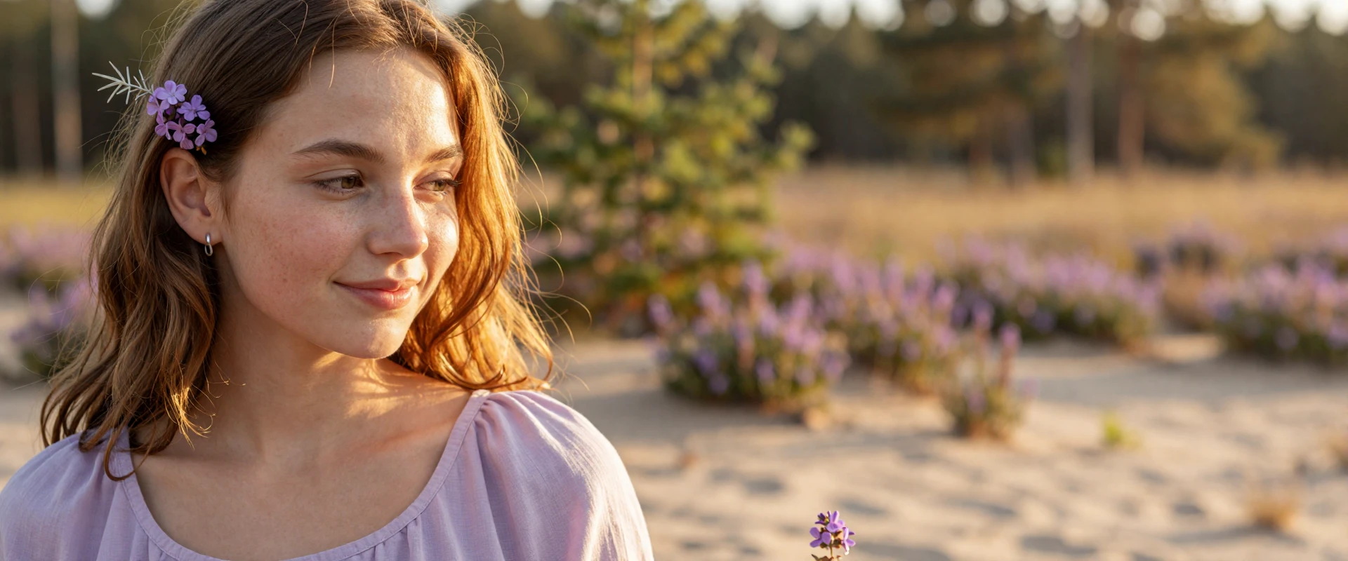
Purple appears on both the favorite and least-favorite lists for men - making it the most polarizing color in men's color preferences research. More women favor it than men, but those men who do respond to it associate it with luxury and individuality. Deep plum and rich lavender score reasonably well in fashion attractiveness evaluations, though the audience is narrower than for red or black.
Pink, technically a tint of red, ranked second in Kodžoman's 2022 Color Research and Application study, scoring a mean of 4.77 out of 7 across 14 Pantone colors. Its appeal is real, if more skin-tone dependent than black or blue. Kate Spade NY built a significant commercial strategy around pink for women aged 20-40, and it demonstrably drove sales.
Both colors work when worn with intent. They simply require more calibration than the top-ranked options.
Colors That Consistently Underperform in Attraction Research
Several colors show up consistently at the lower end of men's ratings, though the picture is complicated for some.
- Grey and green - Sidhu et al. (2021) found these produced the lowest attractiveness scores and the highest perceived body-size ratings of all colors tested.
- Yellow - Roberts et al. (2010) rated it among the least attractive on women. Yet Kodžoman (2022) in Color Research and Application ranked yellow third, with a mean score of 4.72. Yellow's results appear highly dependent on shade and study design.
- Orange and brown - These rank as least-favorite in general preference surveys. One survey found 26% of respondents associated orange with cheapness.
- White - Scored lowest in Roberts et al. (2010), though Sidhu et al. found white still registers as attractive despite suggesting a larger silhouette.
None of these are categorically unwearable. Skin tone and context shift individual outcomes significantly - which the next sections address.
How Skin Tone Changes Everything: Your Undertone Is the Real Variable
The ranked color lists above are averages across diverse participants. They don't account for the most important modifier of any color's effect: the undertone of the person wearing it. The same red looks vibrant on one woman and draining on another - not because of the color itself, but because of how it interacts with her skin's underlying hue.
Skin tone color matching starts with understanding undertones. Undertone is the subtle, underlying color cast in your skin - separate from whether your complexion is light, medium, or deep. The three categories are warm (yellow, golden, or peachy cast), cool (pink, blue, or reddish cast), and neutral (a balanced mix of both).
Warm undertones glow in earthy reds and rich oranges but can be overwhelmed by cool jewel tones. Cool undertones are transformed by cobalt, ruby, and emerald but may look washed out in warm mustard or terracotta. Knowing your undertone shifts the question from "what does research say?" to "what does research say - for me?"
Three Tests to Find Your Undertone Right Now
Try the vein test right now - it takes thirty seconds and requires no special equipment.
- Vein color test: Turn your wrist over in natural light. Green veins indicate warm. Blue or purple indicate cool. A mix of both points to neutral.
- White shirt test: Hold a pure white shirt against your bare face in natural light. If your skin looks golden or yellowish, you're warm. If it looks pink or rosy, you're cool. Neither? Probably neutral.
- Jewelry test: Which metal has always looked better on you? Gold flatters warm undertones. Silver flatters cool. Both work equally well? That points to neutral.
- Sun reaction: Burn easily rather than tan? Likely cool. Tan readily with little burning? Likely warm.
Two or more matching results across these tests give a reliable answer. Use it as the foundation for every color decision that follows.
Color Recommendations by Undertone: A Practical Breakdown
This table maps undertone categories to their most flattering color ranges - a practical tool for applying skin tone color matching to the research rankings above.
Treat this as a starting point, not a verdict. A color worn with confidence from your recommended column will consistently outperform a higher-ranked color worn with doubt.
The Seasonal Color System: How It Extends Your Undertone Knowledge

Undertone is the foundation, but the seasonal color analysis system adds hair and eye color to the equation. The system places people into four categories - Spring, Summer, Autumn, Winter - each linked to a palette of flattering clothing colors.
Spring is warm and light: coral, peach, aqua, ivory. Summer is cool and muted: soft blues, lavender, rose pink. Autumn is warm and deep: rust, olive, mustard, burnt orange. Winter is cool and high-contrast: deep navy, emerald, crisp white, and black.
As of 2026, this system remains widely used in personal styling. It's not fixed permanently - dyeing your hair or going gray changes the inputs, which means your most flattering palette may shift. Each season also contains three subcategories (dark, true, and bright) for more precise matching when the main category doesn't quite fit.
Choosing Colors by Occasion: What Works Where
Color choice becomes clearer when you map it to the impression you're trying to make. The table below shows how different color categories perform across common contexts.
Darker tones - navy, maroon, charcoal - suit winter months naturally; lighter and warmer shades work better in spring and summer. One practical note: a red bag or a cobalt scarf can test a color's effect without requiring a full outfit change.
The Date Context: Red and Deep Colors for Romantic Settings
When the occasion is explicitly romantic, red and deep colors have a research-backed advantage. Elliot and Niesta (2008) showed men were willing to spend significantly more on a date with a woman in red - a finding specifically tied to romantic contexts, where the color's signal lands as intended.
Deep purple works similarly. Both communicate romantic intent clearly and function best when that signal is deliberate. A third dinner date is a different context from a first coffee meeting, and color choice can reflect that.
Red at a candlelit restaurant reads very differently from red at a Sunday afternoon park walk. The question isn't which color ranks highest - it's whether the setting supports the signal you're sending. Think about what you want the color to say before committing to it. Intentionality matters more than formula here.
When Red Doesn't Help: Contexts Where Softer Colors Win
Color-in-Context Theory (Elliot and Maier, 2012) is direct on this: red's attraction effect only activates in affiliative, romantic contexts (meaning environments where bonding and desire are the main currency). In achievement settings - job interviews, competitive environments - red triggers avoidance responses and is associated with failure. Wearing it to an interview may compete with the impression of competence you're trying to build.
For casual first meetings, blue and soft neutrals consistently outperform bold colors. These shades communicate approachability and emotional warmth - qualities that matter more in early-stage relationship building than in raw attraction ratings.
Red is bolder. Blue tends to be stickier. In the phase where someone is deciding whether they feel comfortable around you - not just attracted - the choice between passion and trustworthiness is worth making deliberately.
Confidence as the Real Attractor: What the Research Misses
Here's what the ranked color lists don't capture: the color you wear most confidently will frequently outperform the research-endorsed color worn with visible uncertainty. This isn't motivational filler - there's actual data behind it.
In Roberts et al. (2010), when shirt colors were obscured so raters couldn't see them, wearers of red and black still showed slightly more attractive facial expressions than wearers of other colors. The researchers concluded that power colors affect how the wearer carries themselves - posture, eye contact, expression - not just how observers respond to the color itself.
This creates a feedback loop: wearing a color you feel good in boosts how you present yourself, which increases how attractive others find you - regardless of the specific hue. Color research identifies useful patterns, but the variable most within your control may matter most. If burgundy makes you feel sharp and red feels performative, that's relevant data too.
What Men Actually Notice vs. What Research Measures

Attraction research captures initial visual responses under controlled conditions. Men in these studies rated photographs - flat images of women they had never met, would never speak to, and whose personalities they knew nothing about. That's a narrow slice of how attraction actually works.
In real-world dating, the variables multiply fast. Conversation, humor, body language, how someone makes you feel in the first ten minutes - none of these appear in a photo rating study. The gap between a controlled experiment and an actual date is significant.
This doesn't undermine the research. The red effect is real, the black data is consistent, and blue's trust associations are well-documented. But these findings describe tendencies in averages - not guarantees. Men also vary in color perception: approximately 7% are color blind (Howard Hughes Medical Institute data), meaning a portion of any real audience perceives color less precisely than study conditions assume. Color is a useful signal. Not a decisive one.
A Quick Guide to Colors Men Prefer: Ranked by Research Strength
Here are the colors men like on women, ranked by strength of research support.
- Red - Strongest support. Elliot and Niesta (2008), confirmed by 2018 meta-analysis. Boosts perceived sexual attractiveness in romantic contexts.
- Black - Consistent second across multiple studies. Associated with sophistication and a slimmer silhouette (Sidhu et al., 2021). Highly versatile.
- Blue - Third in Roberts et al. (2010). Signals trust and approachability; works across most skin tones.
- Purple / Deep jewel tones - Niche appeal. Deep plum and rich violet perform well in fashion evaluations; more popular with women than men overall.
- Pink - Real appeal in saturated shades. Second in Kodžoman (2022). More skin-tone dependent than the top three.
- Yellow / Brown - Mixed support. Yellow's results conflict across studies; both colors depend heavily on undertone and shade.
These rankings are research averages. Undertone, occasion, and confidence all modify where any color lands for any individual woman.
How to Use This Research Without Losing Your Own Style
The research is one input - not the only one. Using it well means layering it onto what you already know about yourself, not replacing instinct with a ranked list.
A practical approach works in three steps. Start with the undertone tests to establish your personal palette. That's your foundation. Then apply the occasion framework: when the context is romantic, pull from the bolder end of your palette; when trust matters more, move toward calmer shades. Finally, from that shortlist, choose the color you'd actually reach for anyway - the one you feel most settled in.
Next time you're picking an outfit for a date, consider what signal you want to send. If the color that tops the research list is also the one you'd have chosen anyway, you're working with an unusually strong combination. Style built on self-knowledge reads that way - coherent, natural, and hard to dismiss.
The Bottom Line: Research Points to Red, But Confidence Points to You
Color research identifies real patterns. Red has the strongest attraction data. Black is consistent and versatile. Blue builds the kind of trust that matters for actual relationships. Skin tone modifies all of these, and occasion determines which signal is useful in any given moment.
But the variable with the most direct impact on how attractive you appear is how confidently you wear what you've chosen. That's not a consolation finding. It's the result that doesn't depend on anyone else's preferences or statistical averages. Knowing what color to wear on a date is useful. Knowing yourself well enough to choose a color you trust is more useful.
The research gives you a map. Where you go with it is your call.
FAQ: What Colors Do Men Find Most Attractive on Women?
Does wearing red on every date make it less effective over time?
For someone meeting you for the first time, no - the red effect operates on first-impression responses and there is no strong evidence that repeated use diminishes it for new people. With an established partner, however, novelty plays a much larger role and habituation over time is considerably more plausible.
Do men notice color consciously, or is the effect mostly subconscious?
Largely subconscious. In Elliot and Niesta's (2008) studies, men gave higher attractiveness ratings to women in red without any awareness that color was influencing their judgments. When asked directly afterward, they could not reliably explain the rating differences. The effect appears to be automatic rather than conscious or deliberate.
Does color preference differ by age group among men?
Age-segmented data on men's color preferences in attraction contexts is limited. Most color-attraction studies recruit college-aged male participants, which may not generalize well across age groups. Older men may weight other attraction qualities - personality, familiarity, status cues - more heavily, potentially reducing color's relative influence on first impressions.
Can accessories in the right color produce the same effect as a full outfit?
Accessories - scarves, bags, statement jewelry - are a practical way to introduce attractive colors without committing to a full outfit change. Whether a small color accent produces the same attraction effect as a full garment has not been directly studied, so the magnitude of the accessory-only effect remains genuinely uncertain.
Does the red effect apply in online dating profile photos?
Probably. The original Elliot and Niesta studies used photographs rather than in-person encounters, which suggests the effect can transfer to static images including dating app profiles. Photo quality, a genuine smile, and natural framing also significantly influence how profile images are received - color is one useful factor among several.
Experience SofiaDate
Find out how we explore the key dimensions of your personality and use those to help you meet people you’ll connect more authentically with.